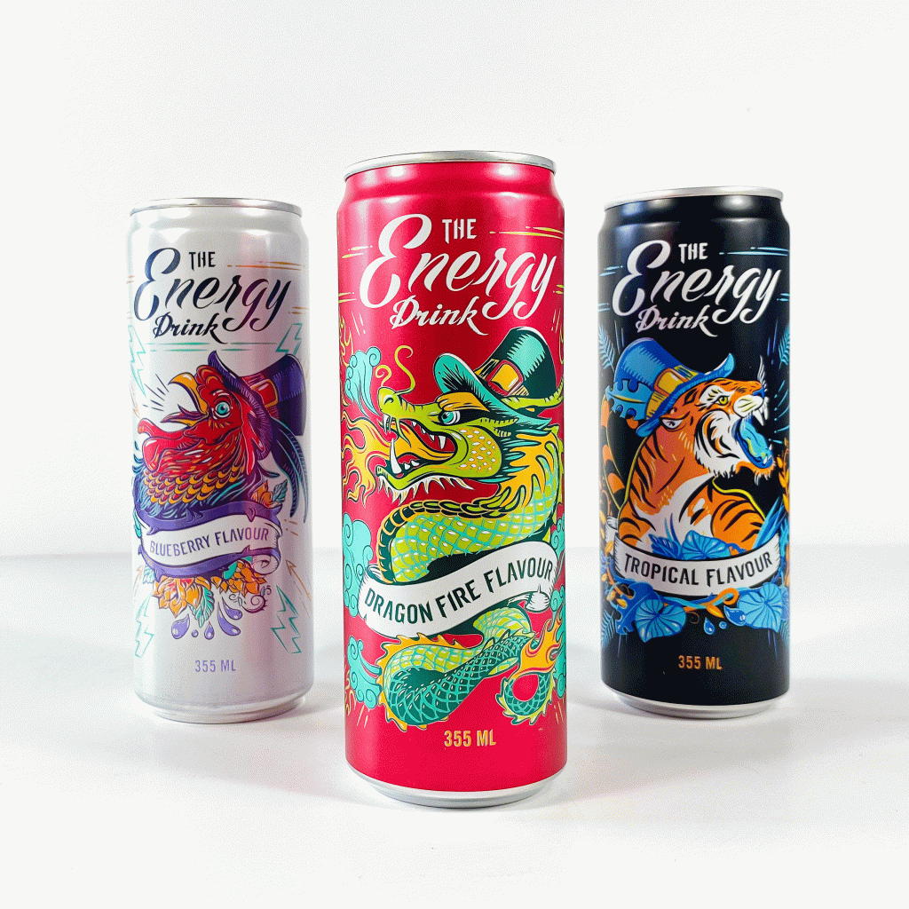
New Flavors Energy Drink for Action


The fire flaming dragon and the roaring tiger joined the energetic rooster on the shelves.
After the big succes of the blueberry flavor, Action asked us to make designs for these new flavors. These will be in the Action stores for a temporary period only.
The fire flaming dragon and the roaring tiger joined the energetic rooster on the shelves.
After the big succes of the blueberry flavor, Action asked us to make designs for these new flavors. These will be in the Action stores for a temporary period only.

The energy drink
With a screaming rooster, The Premium Energy Drink for Action convinces customers that energy and power can actually be purchased.
It was asked to create a Premium energy drink with the look and feel of a limited edition. A stand-alone product that evokes impulse buying. As design of energy drinks is often male oriented, the objective was to create a more gender-neutral design to reach a wider audience.
How can we communicate energy without falling into technical-sporty design language?
The illustration of a screaming rooster was created as a symbol of energetic spirit and new beginnings: Rise & Shine!


With the hat of a modern gypsy, the rooster gets the touch of a vagabond: on the road – ready for new experiences.
In front of the white background, the colourful rooster is the hero of the pack boosting of energy. Illustration style and the chosen colours are communicating limited edition. Furthermore, the illustration was constructed in such a way to get the best results out of the limited printing technique dry-offset.
The result is a fun and modern design that does not limit itself to one target group.
And this design booked immediate results:
Within the short time since its introduction, The Energy Drink has exceeded all selling expectations. It is the most sold energy drink from retailer Action.
As Action is a store for the masses, it made sense to create an energy drink that feels accessible to all ages, genders and situations.